IMPORTX Logo presentation ES · EN
Document

Identity and usage guide

Content

Mark · Symbol · Color · Use

Format

Vector (SVG) · scales losslessly

Agency

Fragatta.com

01

The mark

IMPORTX is set as a single logotype. The X carries the identity: it opens into a chevron pointing forward and reads as movement across a border — goods in transit, not goods held up. The other letters stay quiet and structural so the X can speak.

The mark is delivered as vector artwork on a transparent background. It has no fixed size and no built-in background, so it can sit on any surface and scale with no loss of quality.

02

The symbol

The X lifts cleanly out of the logotype and works on its own as an app icon, favicon, social avatar or stamp. Use it wherever the full logotype would be too small to read: below the minimum width in section 06, reach for the symbol instead of shrinking the mark.

03

Color

Each X is built from two tones: a deeper chevron and a brighter pair of tips. The tips sit about fifteen degrees of hue toward the warmer, brighter side of the chevron, giving the X depth and a sense of direction without introducing a second brand color.

Cobalt
#1B55A727, 85, 167
X chevron — primary
Azure
#2698DE38, 152, 222
X tips — primary
Ink
#19191925, 25, 25
Logotype on light backgrounds
Paper
#FFFFFF255, 255, 255
Logotype on dark backgrounds
Signal red
#D02620208, 38, 32
X chevron — alternate
Ember
#E86028232, 96, 40
X tips — alternate
Emerald
#117A4A17, 122, 74
X chevron — alternate
Spring green
#26AC4E38, 172, 78
X tips — alternate
Graphite
#6C6C6C108, 108, 108
X chevron — monochrome
Silver
#949494148, 148, 148
X tips — monochrome
04

Color versions

Each version is delivered in two builds. The light build carries near-black letters for pale surfaces; the dark build inverts them to white for dark surfaces. The X keeps its color in both, so the identity holds wherever it appears.

Primary — blue
Alternate — red
Alternate — green
Monochrome
05

Construction and clear space

The seven letters share a single cap line and a single baseline, and every edge that should be level or plumb is exactly that. Keep a clear space of at least half the height of the mark on all four sides, marked below with a dotted line. Nothing — type, image edges, rules or the trim of the page — should enter that field.

½H½HH
Proportion
7.35 : 1
Width to height. Always scale both together — never one alone.
Clear space
0.5 × height
On each side. When in doubt, give it more.
Alignment
±0.003
Cap-line and baseline variation across the seven letters, in drawing units.
06

Minimum size

Below 120 px wide on screen, or 30 mm in print, the counters of the O, P and R begin to close up and the mark loses clarity. Use the symbol from section 02 instead.

260 px — comfortable
120 px — minimum
72 px — too small, use the symbol
07

Misuse

The mark's proportions, color and spacing are fixed. These are the five ways it most often gets broken.

Don’t stretch or condense it
Don’t rotate it
Don’t add effects
Don’t place it on low contrast
Don’t re-space or detach the X
08

Downloadable files

Eight SVG files. SVG is vector artwork — drawn with mathematical curves instead of pixels, so a single file stays perfectly sharp at any size, from a favicon to a building sign. All are transparent; pick the light or dark build to suit the surface. Set the width and margin you want below and each file downloads at those exact measurements.

px
px

Set the width and margin you want with your keyboard.

Preview of the logo at the chosen width and margin
Live preview — importx_light_blue.svg
IMPORTX logo with a blue X and near-black letters, on a light background
importx_light_blue.svg
Primary — light backgrounds

Download
IMPORTX logo with a blue X and white letters, on a dark background
importx_dark_blue.svg
Primary — dark backgrounds

Download
IMPORTX logo with a red X and near-black letters, on a light background
importx_light_red.svg
Alternate, red — light backgrounds

Download
IMPORTX logo with a red X and white letters, on a dark background
importx_dark_red.svg
Alternate, red — dark backgrounds

Download
IMPORTX logo with a green X and near-black letters, on a light background
importx_light_green.svg
Alternate, green — light backgrounds

Download
IMPORTX logo with a green X and white letters, on a dark background
importx_dark_green.svg
Alternate, green — dark backgrounds

Download
Monochrome IMPORTX logo with the X in two grays and near-black letters, on a light background
importx_light_grey.svg
Monochrome — light backgrounds

Download
Monochrome IMPORTX logo with the X in two grays and white letters, on a dark background
importx_dark_grey.svg
Monochrome — dark backgrounds
Download
09

Before and after

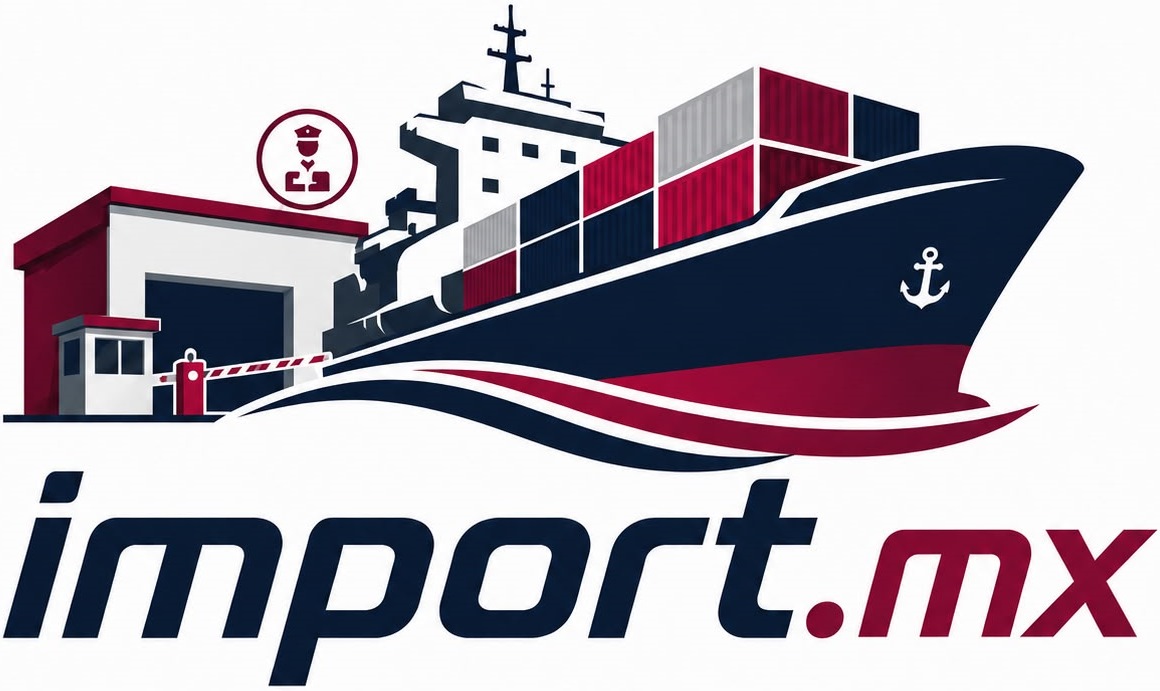
For reference, the mark being replaced, next to the one this document specifies.

The previous logo asked a single piece of art to carry a ship, a warehouse, a gate, a badge and a tagline. Five things competing for attention at any size — and at the size a logo is actually seen, in a browser tab or the corner of an invoice, none survive. The new mark carries the name and nothing else, so it reads at a glance and stays the same mark everywhere.

The tagline it carried, We connect your business to the world, works better as live text beside the mark than embedded in it: that way it can be translated, resized or dropped without anyone needing a new file.

The previous logo: a container ship, a warehouse, a gate and a badge drawn above the name import.mx and the tagline Conectamos tu negocio con el mundo
Before — the current logo
After — the mark this document specifies
Format
Vector
Curves instead of pixels, so a single file is sharp from a favicon to a building sign. The previous art was a fixed grid of pixels that softened as it grew.
Background
Transparent
The mark sits on whatever surface is behind it. The previous file brought its own white background, so it landed like a white card on anything that wasn’t white.
Color
Three
One ink and two blues, listed in section 03. The previous art’s colors were never written down anywhere, and being a compressed photo of a drawing it holds thousands of distinct pixel values — there’s no list to hand a printer.
10

In the interface

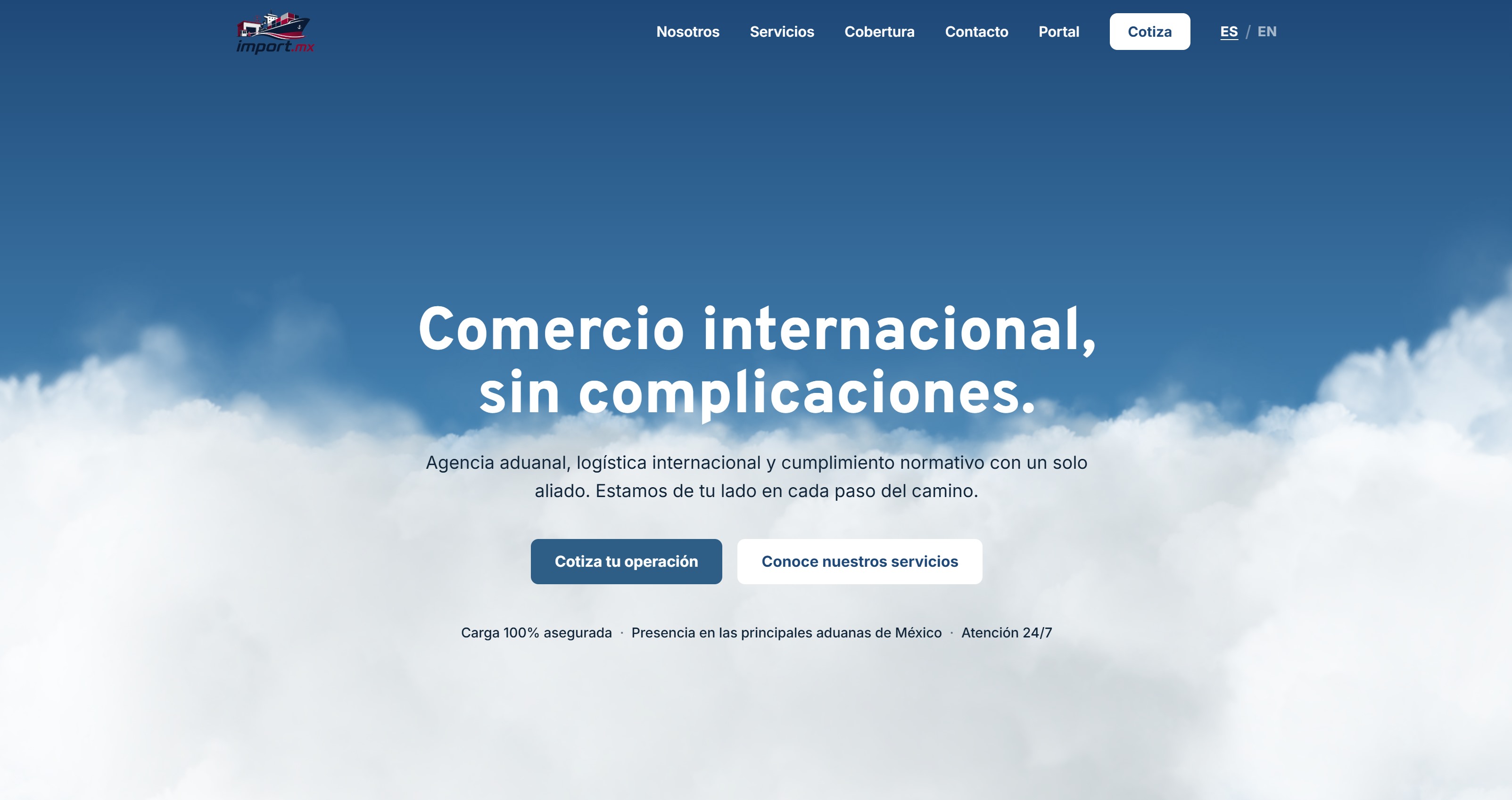
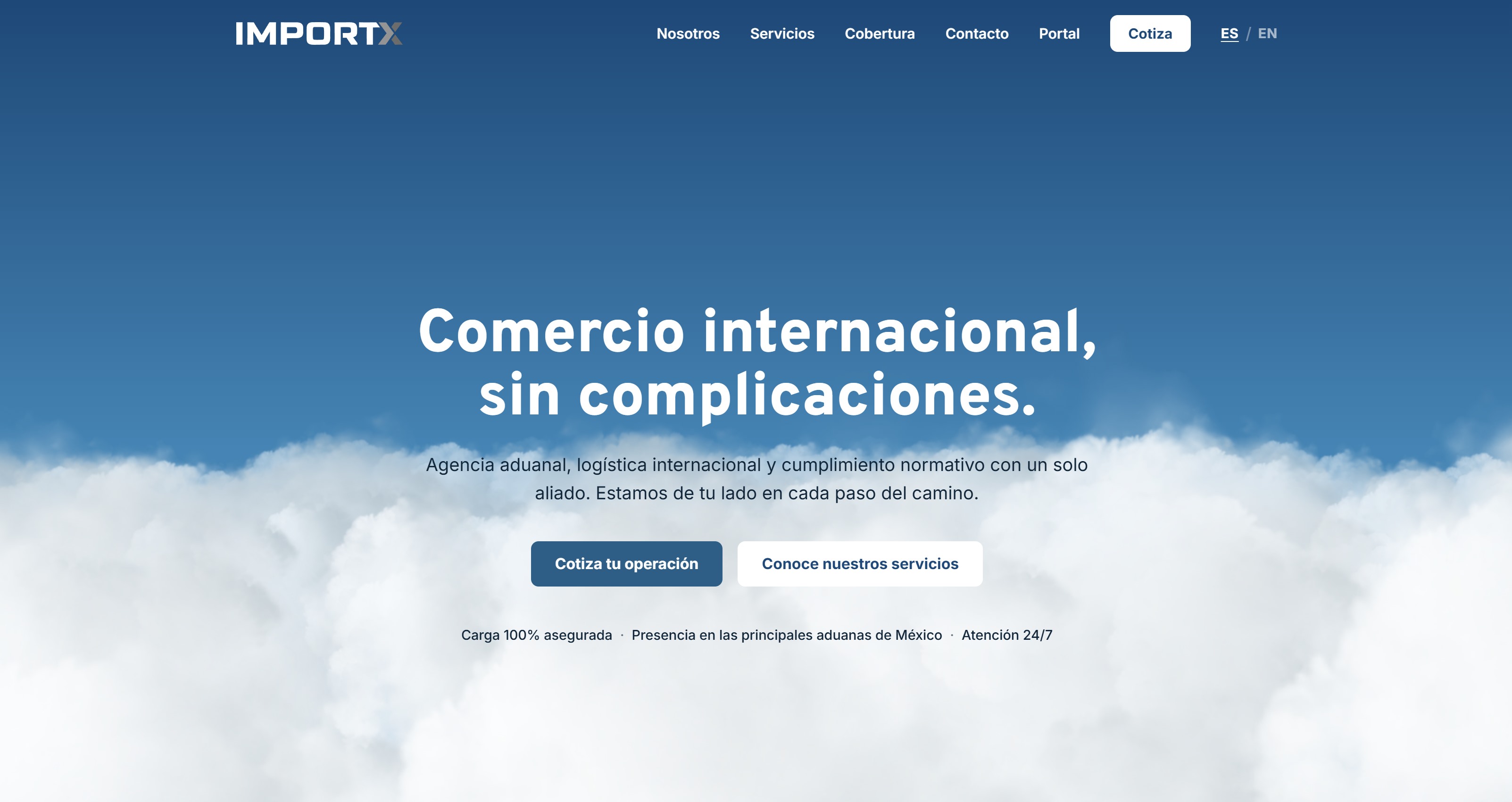
The same page, at the same scroll position, with each mark in the header.

The two aren’t shown at the same height, and that’s deliberate. The new logo runs at the header’s own 24 px. The old one is given 50 px, because at 24 there isn’t enough of it left to discuss. Even at double the height, it asks the eye to resolve a ship, a warehouse, a gate and a badge in the corner of a page — where the new mark asks it to read a word.

The home page with the previous import.mx logo in the header, at 50 pixels tall
Before — the previous logo, at 50 px
The same home page with the new IMPORTX logo in the header, at the site’s own 24 pixels
After — the new logo, at the header’s own 24 px

IMPORTX — logo presentation. Artwork delivered as vector SVG on a transparent background. Designed by Fragatta.com.